Design Studio
| Table of Contents | |||||
|---|---|---|---|---|---|
| Getting Started | Ideation Studio | Design Studio | Project Hub | Build Studio | Go Live |
Design Studio
The Design Studio helps users choose the right solution by providing a variety of pre-defined modules for their projects. These modules can be customized to suit individual needs, allowing users to personalize their pages. Additionally, users can easily view and calculate estimated costs through the platform.
Build Application
Customize Module
Before starting to build your application, it's important to navigate through the Project Hub to access the necessary tools and resources. This guide will help you find your project, choose the right platform, and start the design process. Follow these steps to set up your application and customize its features.
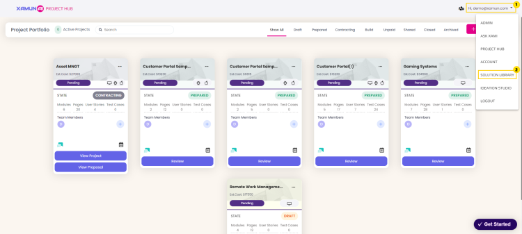
1. From the Project Hub, click the dropdown button on the top right corner to view the list of Xamun modules.
2. Click ‘Solution Library’ to be directed to the page.
3. Click the ‘View Detail’ button on your chosen project to view its design preview.
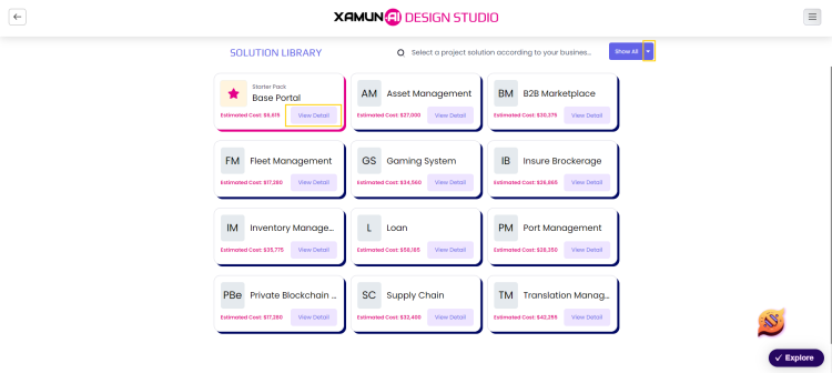
Note: To view your projects by category, click the dropdown button next to the search bar.
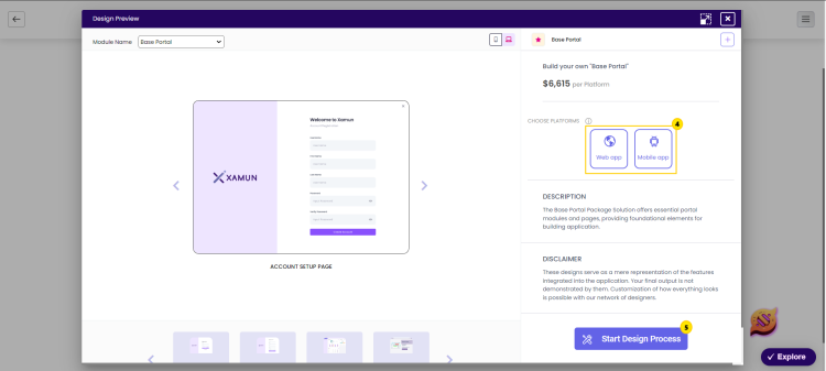
4. Click on your preferred platform.
5. To start building your application, click the '‘Start Design Process’ button.
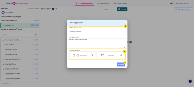
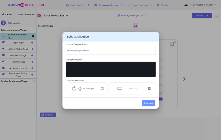
6. The 'Build Application' form will appear on your screen.
7. Enter your solution project name and write a short description of your project.
8. Select your platform by clicking the checkbox.
9. Click the ‘Proceed’ button.
| Feature | Description |
|---|---|
| Solution Project Name | • Input here the name of your project. • Required Field |
| Short Description | • Input here a short description of your project. |
| Choose Platforms | • Choose the best platform/s appropriate for your project. |
| Proceed | • If clicked, you can now customized your application's module/s. |
Updated on: 08/21/2024
Module Configuration
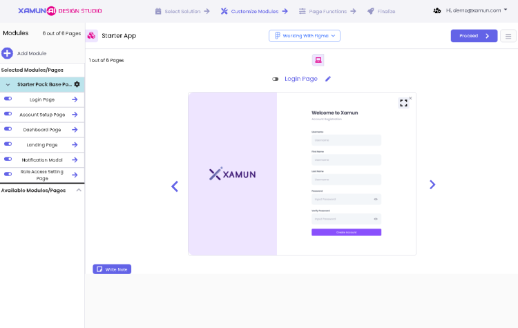
This is the second step in creating a project. It contains the List of Modules, Page Preview, Module Description, and Solution Information.
In this step, the user can modify or add modules based on the selected Solution to fit the business needs or requirements.
By starting to enter Project Name, Select its Platform, and Short Description for your Project.
| Feature | Description |
|---|---|
| Solution Project Name | • Input here the name of your project. • Required Field |
| Short Description | • Input here a short description of your project. |
| Choose Platforms | • Choose the best platform/s appropriate for your project. |
| Proceed | • If clicked, you can now customized your application's module/s. |
| Feature | Description |
|---|---|
| Working with Figma | • If clicked, you can choose EXPORT SOLUTION, IMPORT SOLUTION, and MEDIA LIBRARY. |
| Number of Module Pages | • Number of pages available from Xamun Library vs to be designed pages suggested by AI. |
| Add (+) button | • Found on the upper left corner of the Module list. • If clicked, it will show a popup to choose beTween ADD NEW MODULE FROM LIBRARY or ADD BLANK MODULE page. |
| Arrow Up/Down Icon beside the module | • If arrow up is clicked, it will list down all the pages of the selected module. • If arrow down is clicked, it will hide all the pages of the selected module. |
| Module Setting (Gear Icon) | • If clicked, it will show the two kinds of adding the page, namely: Add page from library, Add blank page. |
| Clickable Page Name | • If clicked, it will display the page preview. |
| Switch / Toggle Button | • Found on the left side of the page name. • If clicked, it will Toggle button to remove or add page. |
| Right Arrow beside the page name | • If clicked, it will show DESIGN PREVIEW page. |
| Available Modules/Pages | • If clicked, it will display more modules and pages. |
| Proceed | • If clicked and validations passed, it will redirect to the next step. • If validations fail, an error message must be displayed. |
| Menu Icon | • Found on the most upper right corner of the page beside PROCEED button. • If clicked, it will show the SOLUTION INFORMATION page. |
| Web/Mobile Toggle | • If web toggle is clicked, it will show the web view. • If mobile toggle is clicked, it will show the mobile view. |
| Arrow Navigator (left and right) | • It will be shown if the selected module has multiple pages. • If left arrow is clicked, it will navigate to the next page. • If right arrow is clicked, it will navigate to the previous page. |
| Write Note | • If clicked, it will open the Note popup page. |
| Edit Note | • If clicked, it will open the Note popup page with the previously saved information. |
| Add Page from library | • If clicked, it will redirect to ADD PAGE. • See PERSONALIZE MODULE section > ADD PAGE VIEW for more details. • Inside Gear Icon (Module Settings). |
| Add blank page | • If clicked, the screen will show a blank page. • Inside Gear Icon (Module Settings). |
Add Module
Add Module from Library
To enhance your project with additional features, you can easily add modules from the library. Follow these steps to easily add new modules to your project:
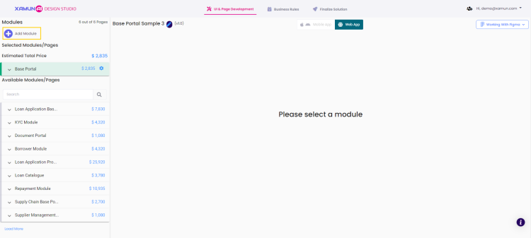
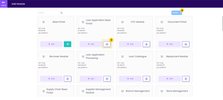
1. Click the ‘Add’ icon to add a Module to your project.
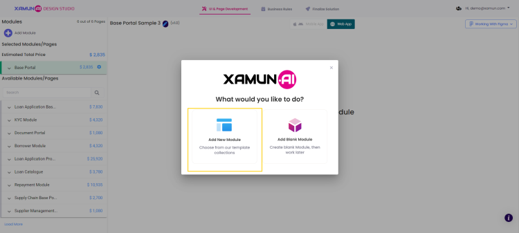
2. Select the ‘Add New Module’ to view the lists of modules you can choose from.
3. Tap the ‘+’ button on the module you would like to add.
4. Click the ‘proceed’ button once you are satisfied with your selection.
5. The new modules will be shown alongside your existing module.
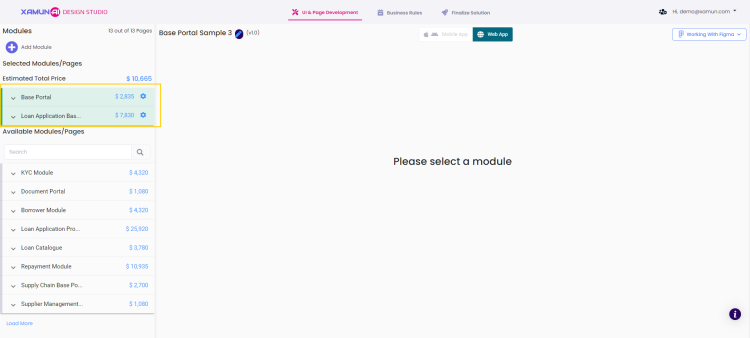
| Feature | Description |
|---|---|
| Add Module | • Will display the choices to add a module.. |
| Add New Module | • Will direct to the page with the list of modules. |
| Add Blank Module | • A blank module will automatically be added on your project. |
| Add [+] | • The module will be selected. |
| Proceed | • The selected modules will be added on your project. |
Updated on: 08/29/2024
Add Blank Module
To start organizing your project, add a new blank module. This will give you a fresh space for design. Follow these steps to create and name your module:
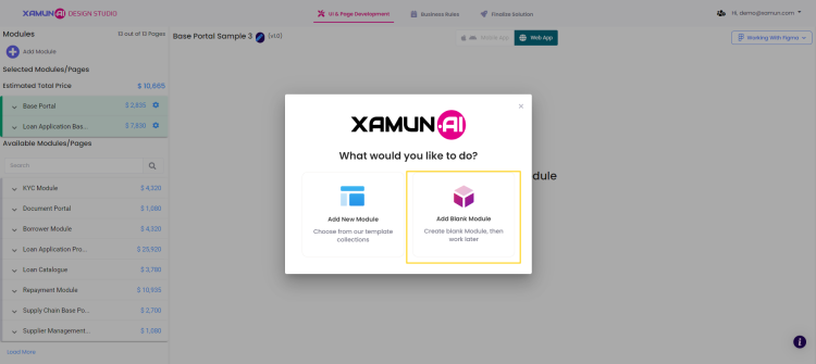
1. Click the ‘Add’ icon to add a Module to your project.

2. Choose ‘Add Blank Module’ to create a blank module available for design.
3. The blank module you add will appear below your existing modules, under the label ‘To Be Designed’.
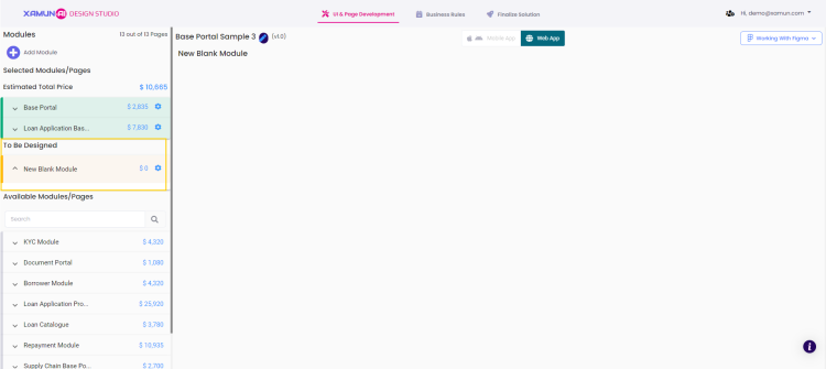
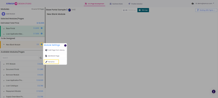
4. Click the ‘settings’ button to access options for your blank module.
5. Choose ‘Rename’ to modify the module name.
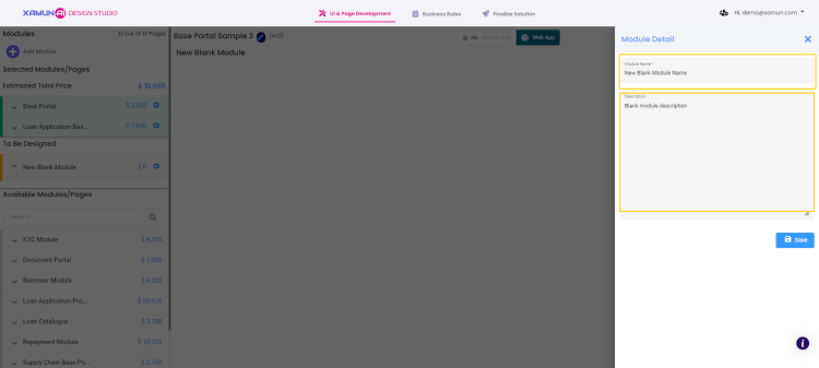
6. The ‘Module Detail’ form will appear on the right side of the page.
7. Enter the new name for your module and add a description.
8. Click ‘save’ to apply the changes.
| Feature | Description |
|---|---|
| Add Module | • Will display the choices to add a module. |
| Add New Module | • Will direct to the page with the list of modules. |
| Add Blank Module | • A blank module will automatically be added on your project. |
Updated on: 08/29/2024
Add User Story
Add User Story enables you to create and document user stories, providing a clear description of features or functionalities from the end user's perspective. This helps teams understand user needs and plan development tasks accordingly. This guide will walk you through the steps to add a user story.
1. In the Xamun Project Hub, click on one of the projects you want to add a user story.
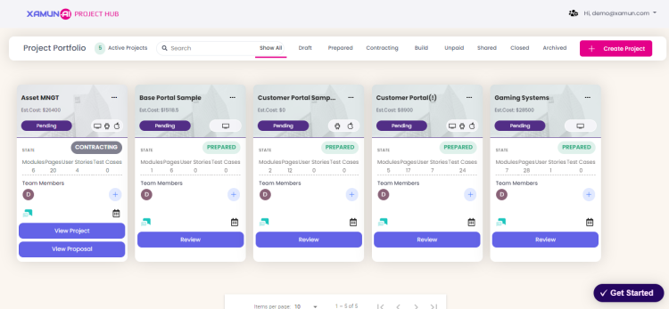
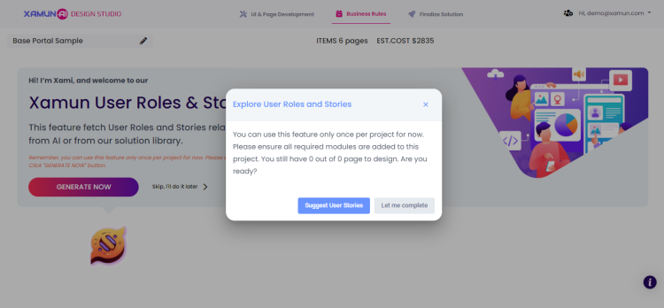
2. To ask Xami to generate a user story, click on the Business Rules, then Generate Now.
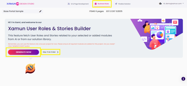
3. Click on the Suggest User Stories button so Xami will produce User Roles and User Stories.
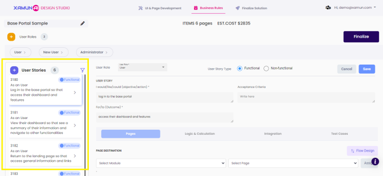
4. These are the user stories generated by Xami. You can see if they are functional or non-functional, the associated roles, and use the filter button to narrow down your options.
Note: By clicking on a user story, you can view additional details such as logic & calculation and integration. You can make edits and then click Save.
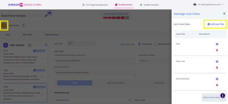
5. To add more user roles, click the + button at the upper left corner, then Add User Role.
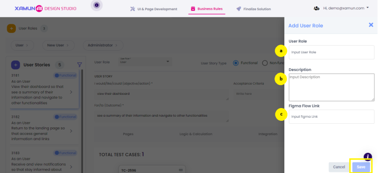
6. Complete all necessary information by filling in the following fields, then click on Save.
a. User Role
b. Description
c. Figma Flow Link
| Feature | Description |
|---|---|
| User Role | • Specify the role of the user within the project or application (e.g., Administrator, Developer, Designer). • Required Field |
| Description | • Provide a detailed description of the user role, including responsibilities, permissions, and any relevant information about their function. • Required Field |
| Figma Flow Link | • Include a link to a Figma flow or design that visually represents the user's journey or the design process related to this role. |
| Save | • Click this button to save the entered details and link. |
Updated on: 09/05/2024
Add Test Case
Editing Modules
Add Page
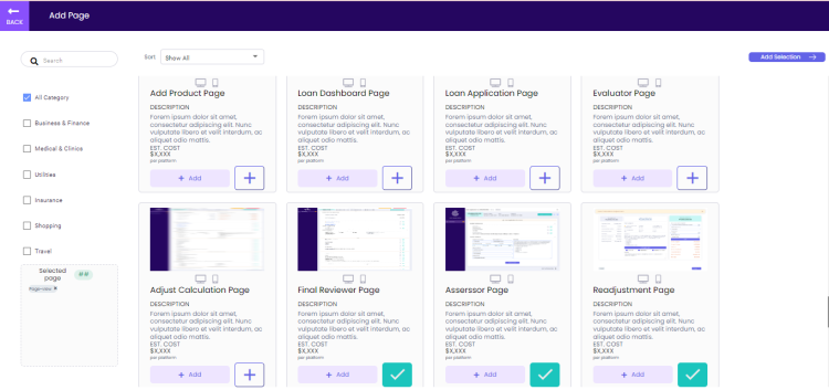
This page contains the list of pages not included in the pre-selected modules. The user has the option to add more pages through this screen and be part of the solution building.
| Feature | Description |
|---|---|
| Back | • If clicked, it will go back to Personalize page. • No changes must be saved. |
| Search | • If letter/words are entered, it will display the filtered pages based on the inputted values. |
| Categories Checkbox | • User has the option to filter the categories. • If category was selected, it will display only the pages based on the selected category. |
| Add Selection | • If clicked and selected a page, it will go back to Personalize page and include the selected page under the module. • If clicked and nothing is selected, it will go back to Personalize page. |
| Add | • If clicked, it will be selected and listed on the last part of the pages. • Check mark will be shown instead of add button. |
Add Page From Library
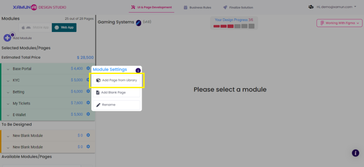
Add Page from Library enables you to quickly add pre-designed pages from a library of templates. This saves time and ensures consistency in your project. This guide will walk you through the steps to add a page from the library.
1. Once you click on the project you are working on, select the settings button and choose Add Page from Library to access multiple options.
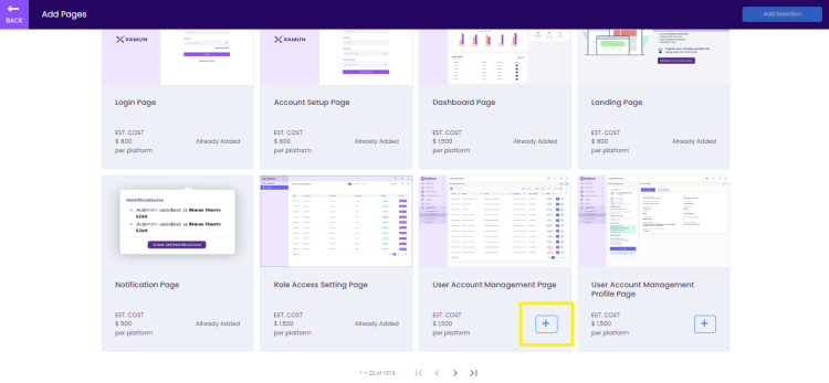
2. If you want to add more pages to your project, click the + button, and the page will be automatically added to your project.
Updated on: 09/05/2024
Add Blank Page
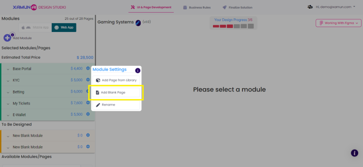
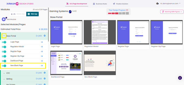
Add Blank Page enables you to create a new page from scratch, offering complete flexibility in design and content. This option is ideal for custom layouts and unique content needs. This guide will walk you through the steps to add a blank page.
1. Once you click on the project you are working on, select the settings button and choose Add Blank Page to create a new page.
2. By clicking the dropdown button, you can access the newly added blank page.
Updated on: 09/05/2024
Editing Pages
Removing Pages
Working with Figma
Export Solution
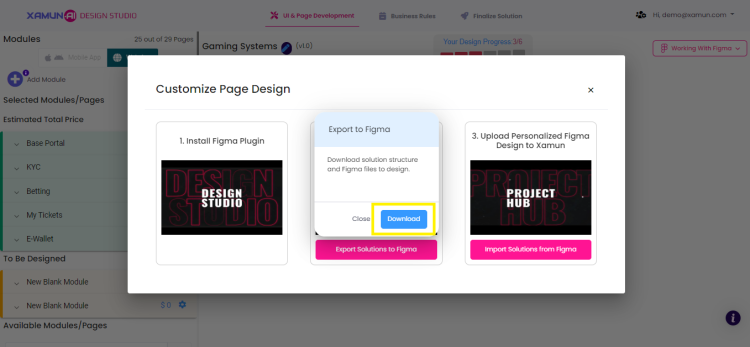
Export Solution enables you to export your project or solution into a shareable file format, making it accessible outside the platform. This helps in distributing the project or collaborating with others. This guide will walk you through the steps to export your solution.
1. Once you select the project you are working on, click Working With Figma in the upper right corner.
2. From the dropdown list, select Export Solutions to Figma.
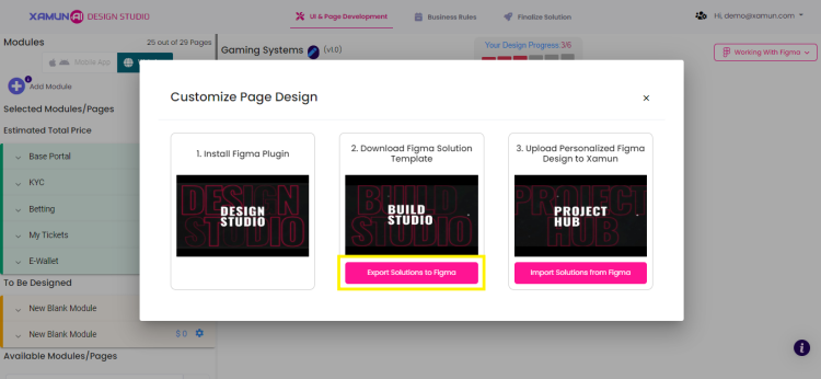
3. Click Download to export the solution structure and Figma files for design.
Updated on: 09/05/2024
Import Solution
1. Click the ‘Working with Figma’ dropdown to see the available Figma options.
2. Select ‘Import Solution’ and the ‘Import from Figma’ form will appear on your screen.

3. Enter the access token.
4. Provide the link to the Figma document you wish to import.
5. Click the ‘Connect’ button to link the Figma document to your project.

| Feature | Description |
|---|---|
| Working with Figma | • Shows the options on working with Figma. |
| Access Token | • Can be found on your Figma account, just generate and copy your personal access token. |
| Figma Document URL | • The url of your solution. • Copy it into your solution in Figma. |
| Select Canvas Page | • Choose the page of your solution in the dropdown menu. |
Updated on: 09/04/2024
Media Library
Add a video of the prototype of your solution.
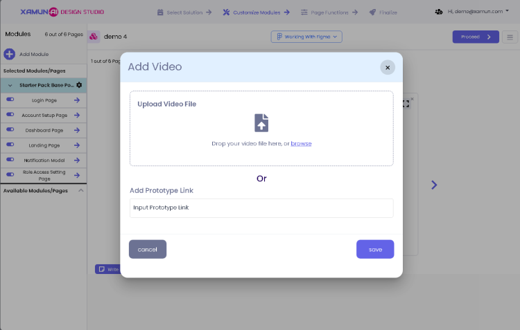
| Feature | Description |
|---|---|
| Upload Video File | • To upload a file video of your prototype. |
| Add Prototype Link | • To upload a video link of your prototype. |
Write Note
Add a Note
Page Functions
Add Functional Details
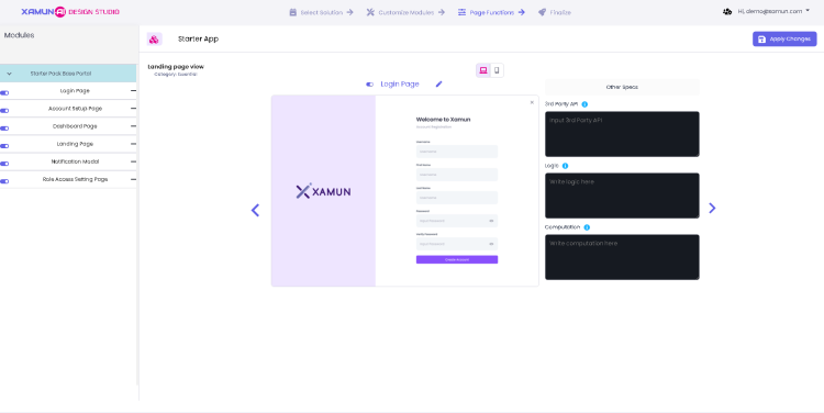
This is the third step in creating a project. In this step, the user can personalize the Page per Module or Add Pages that are not included in the module.
| Feature | Description |
|---|---|
| Other Specs | • You can edit or add functional details to the page you're working on, including third-party APIs, logic, and computations. |
| Apply changes | • If clicked, it will apply all the changes made, if there are any, and redirect to the FINALIZE step. • If clicked and nothing was updated, no changes must be saved and will redirect to the FINALIZE step. |
Finalize
Solution Summary
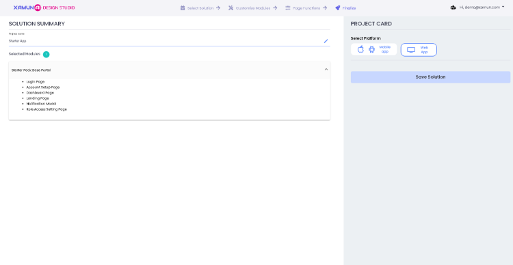
This is the last step in creating a project. The user can see the Solution Summary with total number of selected modules, Add-Ons and Project Card with selected platform.
| Feature | Description |
|---|---|
| Edit Project Name | • If clicked, it will allow the user to change the project name. |
| Selected Modules | • If clicked, it will show lists of pages that you selected and designed. |
| Platform Selection | • You can choose your platform for your solution. |
| Save Solution | • If clicked, it will save the created solution as draft and will be able to edit project. |