Build Studio
| Table of Contents | |||||
|---|---|---|---|---|---|
| Getting Started | Ideation Studio | Design Studio | Build Studio | FAQs | |
Build Studio
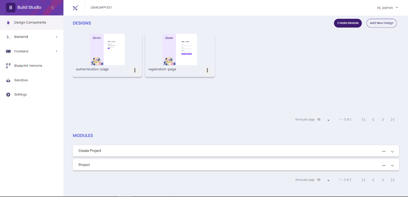
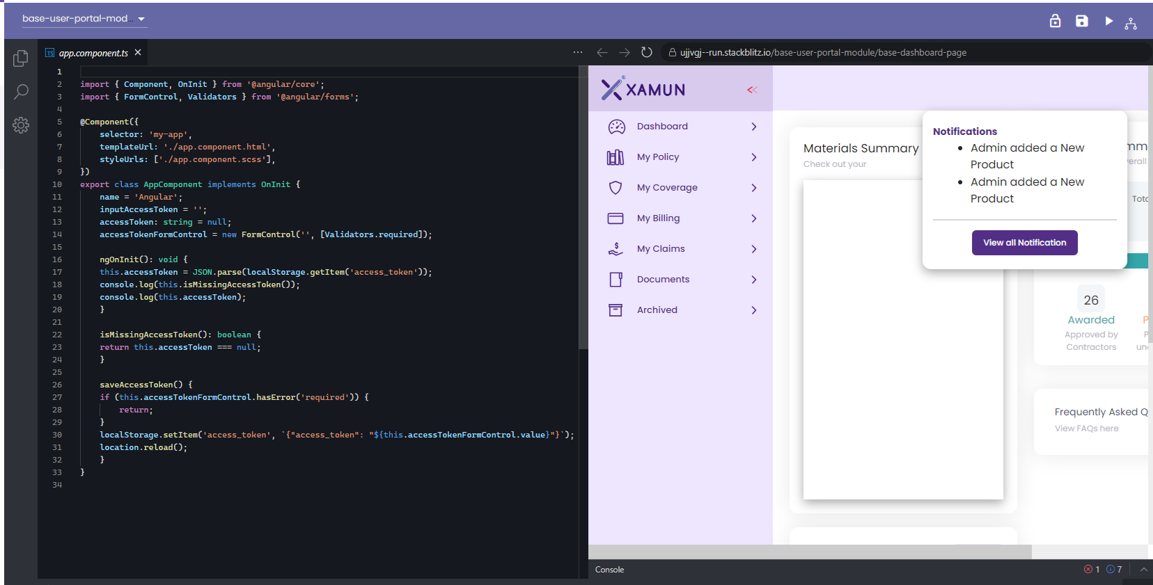
The Build Studio has the backend and frontend setup for the project. The developers can easily build the application using the low-code interface. It also has the feature of deploying the application in an ultra-fast way and testing it.
Check and Confirm Pages
This is the page where the user can check and confirm the pages in the Design components. You can view this page after creating a project or application.
In this section, the user can group pages by module, which is applicable only for Web Applications.
| Feature | Description |
|---|---|
| Design Components | • Paginated list of designs. |
| Create Module Button | • Create Module button should be disabled when all designs/pages are added in a group. • The user will be able to create module. |
| Add New Design | • A dialog will appear containing the Tenant ID, API Key, Session Keya and App ID with Instructions. • Will import new Figma Design. |
| Modules | • User can Edit/update created modules. • User can Delete created modules. • Paginated list of created modules. |
| Ellipsis | • By clicking the ellipsis button in each design user has the option to view the Design/Page. |
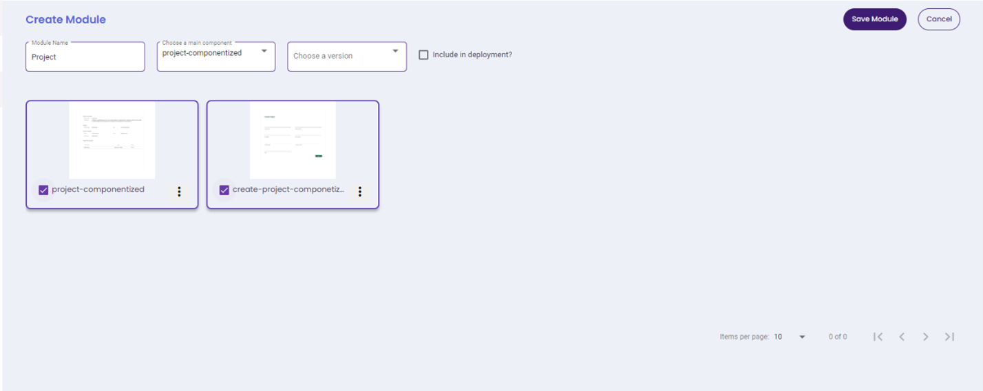
Create Module (For WEB only)
| Feature | Description |
|---|---|
| Create Module | • Group name is required field. • Main component dropdown list should vary based on the selected. Design/Page. This field is a required field. • User has the option to select the Version (Blueprint versions). • At least 2 Designs/Page should be selected when creating a group. |
| Choose Version | • Select a version where this module will be added as part of a version releases. |
| Main Component | • Selection of a page where you will assign as main component. |
| Include in Deployment | • A checkbox where an option to include this module whenever user deploy in Sandbox. |
| Save Button | • Save the created module and it will be added on the list of modules. |
| Cancel Button | • Cancel button will terminate create module action. |
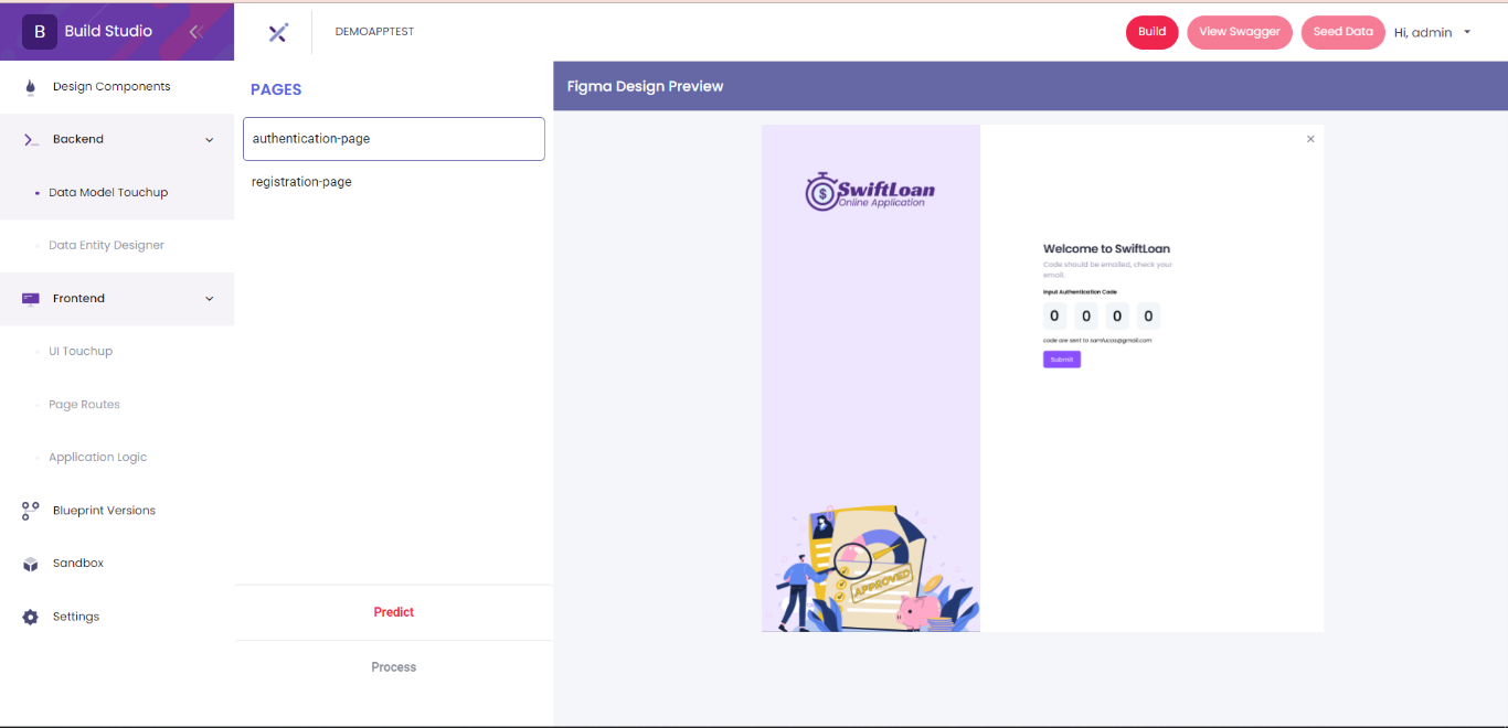
Backend
Data Modelling
At Data Model Touchup, the predicted entity for each page can be set up by extracting the components of the page and setup the parameters.
| Feature | Description |
|---|---|
| Build | • It will build backend data. • Enabled where all pages under backend are filled with data and saved. |
| View Swagger | • View Swagger Documentation when I'm in the pages under backend section. • When clicked, a new tab will appear redirecting to App Swagger Documentation. • It will only be enabled after a successful backend build. |
| Data Model Touchup | • Button toggle option to view for Design Preview and Properties. • List down all pages. |
| Predict | • Predict button will predict entity and parameters in each page. • List of Entity and Properties should be displayed after predicting the page. |
| Process | • The process button should only be enabled when at least one page is setup. • If the Process button is clicked, you will be redirected to the Entity Diagram Designer. • Cancel button will terminate the action. |
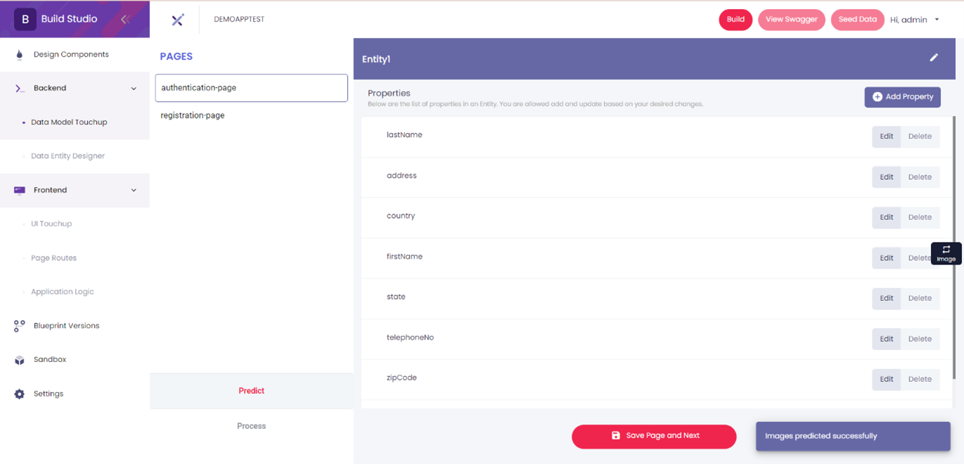
- Entity and Property Maintenance
- It contains the list of pages and its properties where the user has the option to add, edit and delete.
Feature Description Entity • User has the option to Add, Edit, and Delete Entity in each page after predicting. Property • User has the option to Add, Edit, and Delete Properties in each Entity based on desired changes. Transfer • Allows user to transfer Property into other created Entities on the Page. Save Page • Should appear once the page is predicted.
• It will save the created properties in all entities in the same page.Save Page and Next • Should appear once the page is predicted and there’s 2 or more pages
Entity Designer
The Data Entity Designer feature of Build Studio lets developers create and edit the entity of each page of the project.
Once published, developers will be able to view the swagger. Typically, publishing takes about 30 minutes, but a pre-built version of the backup is available.
1. Click on the Backend Dropdown button: Select the dropdown menu in the backend section to access additional features.
2. Open the Data Entity Designer by choosing it from the dropdown on the right side of the page.
3. Press the ‘Add’ button to create a new entity in the designer.

- a. Save button – This button preserves any newly created or edited data entities in the designer.
- b. Reset button – The reset option reverts the entity design to its original data. If no data has been processed from the Data Model Touchup, the current design on the canvas will be erased.
- c. Trash button – Deletes any selected data entity.
- d. Zoom in button – Allows users to magnify the view of the entity designer for better clarity.
- e. Zoom out button – Provides an option to reduce the magnification level of the entity designer.
4. The Entity name is where the users input the title or identifier of the entity in this field.
5. The ‘Add property’ button adds a new property to the list.
6. The Property name lets user assign a unique name to the property; this field is required.
7. The ‘Data Type’ field has a dropdown list of data types to choose from. This field is required.
8. The ‘Is required’ checkbox determines whether the property is required or can stay null.
9. The ‘Trash’ button deletes a property from the list.
10. The ‘Save’ button store the newly created entity and its properties.

11. Input the number of characters allowed for a specific property when the data type is ‘StringField’.
12. For the ‘ForeignKeyField’ data type, this dropdown allows users to select a related existing entity.
13. This field is used to choose an entity when working with the ‘OneToOneField’ data type.
14. Similar to the OneToOneField, this field allows selection of an entity for the ‘ManyToManyField’ data type.
15. Users can set a ‘Default Value’ for the property by typing "true" or "false".

16. After saving the entity, it will be displayed in the entity designer.

Reference Material
| Feature | Description |
|---|---|
| Add button | • Adds a new entity to the data entity designer. |
| Save button | • Saves the existing entities in the designer. |
| Reset button | • Allows users to roll back to original data. |
| Trash button | • Removes any selected data entity. |
| Zoom in button | • Allows user to magnify the view of the designer. |
| Zoom out button | • Reduces the magnification level of the designer. |
| Add property button | • Adds a new property to the list. |
| Property Name | • Assign a unique name for a property. • This is a required field. |
| Data Type | • Lets user choose different data types. • This is a required field. |
| ‘Is Required’ checkbox | • Lets user decide if the property is required or can stay null. |
| Trash button | • Deletes a property from the list. |
| Save button | • Saves the entity and displays it in the entity designer. |
| StringField | • Lets user decide the number characters for the string. • This field is required. |
| ForeignKeyField | • Allows the user to get a primary key from another entity. • This field is required. |
| OneToOneField | • Allows user to choose a One-to-One relationship with another entity. • This field is required. |
| ManyToManyField | • Lets user decide to have a Many-to-Many relationship with another entity. • This field is required. |
| Default Value | • Sets a value of ‘true’ or ‘false’. |
Updated on: 10/01/2024
Route Editor (For Mobile only)
The Route Editor is for Mobile application only. This is where the initial code is displayed, and the developer can maintain the code.

| Feature | Description |
|---|---|
| Editor | • Initial code is displayed where Developer will be able to Edit/Update the code for Routing. |
| Save | • Will save the code in the database. |
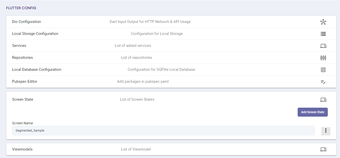
Flutter Config(For Mobile only)
The Flutter Configuration is for Mobile applications only. It contains the list of the configuration.
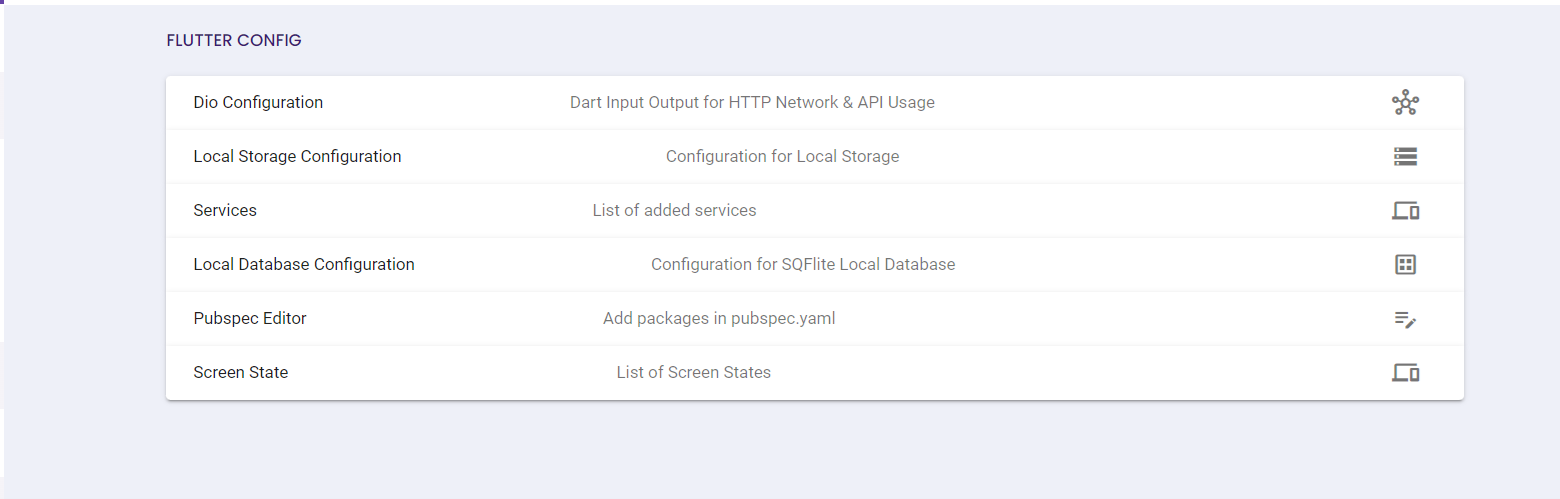
| Feature | Description |
|---|---|
| Dio Configurations | • Dart Input Output for HTTP Network & API Usage |
| Local Storage Configuration | • Configuration for Local Storage |
| Services | • List of added services. |
| Local Database Configuration | • Configuration for SQFlite Local Database. |
| Pub Spec Editor | • Add packages in pubspec.yaml |
| Screen State | • List of Screen States |
- DIO Configuration
- This is the page where the developer can view and edit the Dio Configuration.
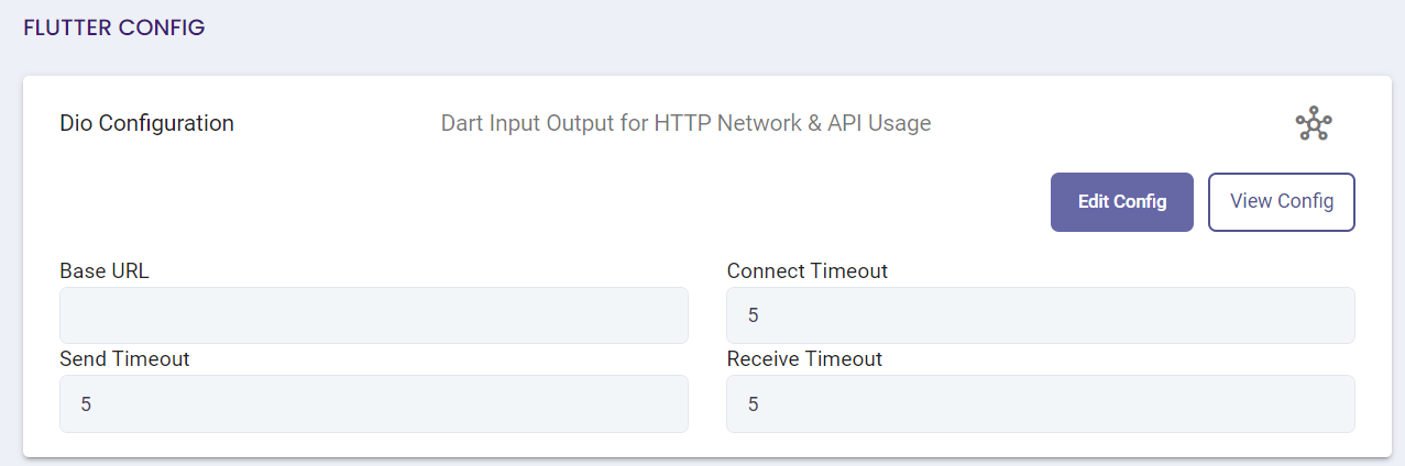
Feature Description Edit Config • Allows user to modify the configurations of Base URL, Connect Timeout, Send Timeout, Receive Timeout.
• All fields are required, and input should be valid when updating config.View Config • A dialog will appear for the user to view the updated code after updating the config. And data inputted should be reflected.
• File name should be “http_client.dart”.Submit • If clicked and if validation passed, entered Dio configuration details will be saved.
• Will only be enabled once validations are passed.Cancel • Terminate update action
- Local Storage Configuration
- This is the page where the developer can view and edit the configuration for Storage Keys.
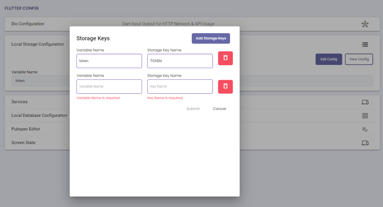
Feature Description Edit Config • Allows user to modify the configurations of Storage Keys.
• All fields are required, and input should be valid when updating config.View Config • A dialog will appear for the user to view the updated code after updating the config. And data inputted should be reflected.
• File name should be “storage_helper.dart”.Add Storage Keys • If clicked, a new line of Variable Name and Storage Key Name fields will be added where user can input details. Delete • If clicked added storage key will be deleted.
• Delete button is per storage keys.
• Will only visible when two or more keys are addedSubmit • If clicked and if validation passed, entered Storage keys configuration details will be saved.
• Will only be enabled once validations are passed.Cancel • Terminate update action
- Services
- This is the page where the developer can add and maintain the services.

Feature Description Add Service • Users are not allowed to add Service if no Model class is created-JSON to Dart.
• All fields are required, and input should be valid when updating config.Add Function • If clicked, another Function fields such Function name, Endpoint, Method, Model and Content will be added where user can input details.
• All fields are required except for Content.
• HTTP Method is a dropdown field which has Post, Put, Delete and Get selection.
• Content Field where user will input valid JSON
• Model is dropdown selection where list is based on created JSON to ModelDelete • If clicked added Function will be deleted.
• Delete button is per Function.
• It will only visible when two or more functions are addedSubmit • If clicked and validation passed, Service will be created.
• It will only be enabled once validations are passed.Cancel • Terminate update action. Ellipsis • Will have ellipses in each created services where these actions are available: Edit, Delete, and View Service file. Edit • Edit allow user to update created Service.
• Updating this file will result in the deletion of the associated files (ViewModel).Delete • Delete allows the user to Delete created Service. View Service Files • A dialog will appear for the user to view the updated code after updating the config. And data entered should be reflected.
• File name should be “<Servicename>_service.dart”.
- Repositories
- This is the page where the developer can view the different repository files.

Feature Description Repositories • Will only appear when there is a created Service.
• Each created service will have a generated Repositories.Ellipsis • Will have ellipses in each created services where these actions are available: View Repository file, View Repository Providing file, View Repository Unit test file, and View Repository Mock Unit Test File. View Repository File • Users will be able to view the generated Repository file in each created service.
• File name should be “<Servicename>_repository.dart”.View Repository Providing File • Users will be able to view the generated Repository Providing File in each created service. • File name should be “<Servicename_repository_providing.dart” View Repository Unit Test File • Users will be able to view the generated Repository Unit Test File in each created service.
• File name should be “<Servicename>_repository_test.dart”.View Repository Mock Unit Test File • Users will be able to view the generated Repository Mock Unit Test File in each created service.
• File name should be “<Servicename>_repository_test.mocks.dart”
- Local Database Configuration
- This is the page where the developer can add and maintain the database configuration.
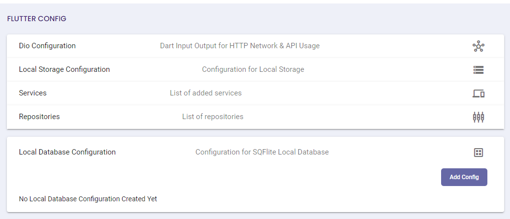
Feature Description Add Config • Allow users to add DB name and password.
• Can only add one configuration detail of Local database.
• DB Name is only required, and Password is optional when creating config.Edit Config • Allows user to modify the DB name and Password of Local Database configurations.
• DB Name is only required, and Password is optional when updating config.View Config • A dialog will appear for the user to view the updated code after adding the config. And database config. entered details should be reflected.
• File name should be “database_helper.dart”.Submit • If clicked and validation passed, Local Database Configuration saved.
• Will only be enabled once validations are passed.Cancel • Terminate Update Action
- Pubspec Editor
- This is the page where the developer can add the packages. The JSON can also be viewed from this page.

Feature Description Add Package • When clicked, a dialog will appear which contains checkboxes of Packages to Add packages in pubspec.yaml. View JSON • A dialog will appear for a generated file after adding packages for user to view the generated xamun-packages.json.
• If no selected package, no file is generated.Select Package • A dialog where the user will be able to tick/select checkboxes for each package.
• Users can select 1 or more packages as desired.Submit • Saved selected packages.
• If clicked “xamun-packages.json” file will be generated.Cancel • Terminate add/update action.
- Screen State
- This is the page where the developer can add and maintain the different Screen State.
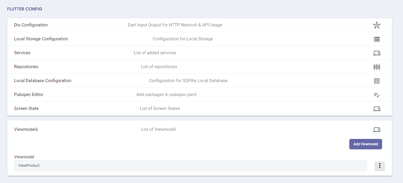
- View Model
- This is the page where the developer can create and maintain the View Model.
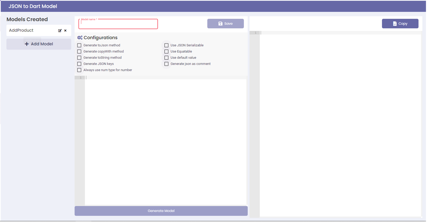
JSON to Dart
The JSON to Dart Model is for Mobile applications only. This is where the developer can create and maintain the different models.
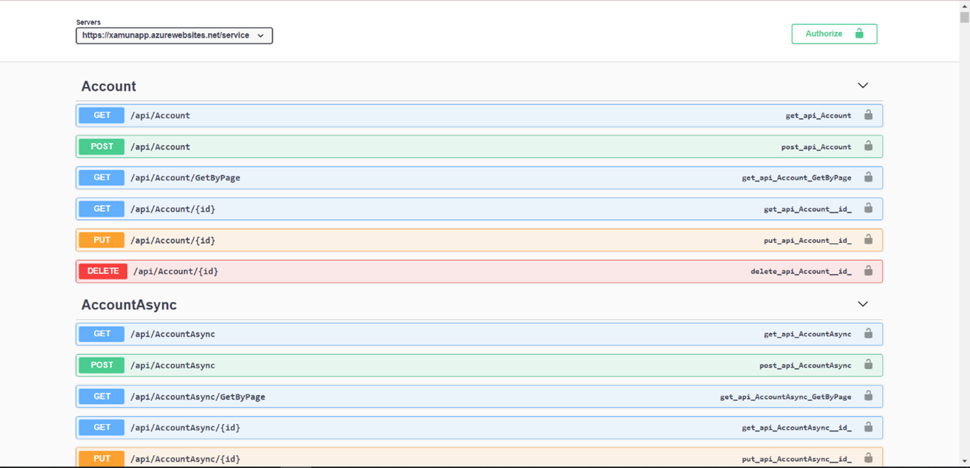
Build API Swagger
Once swagger is viewable, developers will be able to test and view the back end set up and entity flow.
Frontend
UI Touch Up
This is the page where the front-end design and page routing set-up can be generated.
| Feature | Description |
|---|---|
| Build | • Will build Frontend data. • Enabled where all pages except for App Logic under Frontend are filled with data and saved. |
| View App | • When clicked, a new tab will appear redirecting to Deployed App. • Will only be enabled after a successful Frontend build. |
| Dropdown | • List down all the created modules from Design components. • Can switch into different pages by selecting the pages from the dropdown to modify/update code |
| Save | • The save button will allow the user to save modified changes on the codes |
| Process Workflow | • If clicked, it will integrate workflow created from Application Logic. |
| Project | • Contains Info, Files and Dependencies data. |
| Editor | • Will only show Editor Form. |
| Preview | • Will only show Design Preview. |
| Both | • Both Editor and Preview will be visible on the screen. |
| Lock/Unlock | • Lock module so that other users can’t make any changes on the Module. • Unlock module to remove users' restriction on the module. |
Angular Config(For Web Only)
The Angular Config feature is to help developers manage the angular package dependencies and environment variables.
1. In the Xamun Project Hub, navigate to the ‘Build’ tab and select your project.
2. Within the chosen project, click on the Devs tool button.
3. A menu will appear—select ‘Build Studio’ to open the build studio for your specific project.

4. In the project library, click on the ‘Open’ button beside your web application.

5. In the opened project interface, click on the ‘Frontend’ dropdown button.
6. Select ‘Angular Config’ to display the package manager on the right-hand side of the screen.
7. Click the ‘Add Package’ button to add a package in the Angular Package Manager.
- a. To view the package details, click the ‘View Code’ button, which opens a form allowing users to copy the package.json code.
- b. The ‘Edit’ button enables users to modify the package name and version.
- c. The ‘Delete’ button allows users to remove a package from the list.

8. The Add Package form will appear.
9. In the form, enter the package name for the Angular package.
10. Enter the package version of the Angular package.
11. Click the ‘Save Package’ button to save the package in the manager.

12. To create an Environment Variable, click ‘Environment Variable Configuration’ tab.

13. The Angular Environment Variable Configuration panel will be displayed on the screen.
14. Click ‘Add Variable’ button.

15. The Add Variable form will appear.
16. Input Variable Name on the designated textbox.
17. Input Variable Value on its designated textbox.
18. Click ‘Save Variable’ to finalize and store the environment variable.

| Feature | Description |
|---|---|
| Add Package | • Adds a new package to the angular package manager. |
| View Code | • Opens a form allowing users to copy the package.json code. |
| Edit Button | • Allows users to modify the name and version of an existing package. |
| Delete Button | • Removes a package from the Angular Package Manager list. |
| Save Package Button | • Saves the newly added package in the Angular Package Manager. |
| Add Variable Button | • Opens a form to add a new variable in the Angular Environment Configuration. |
| Save Variable Button | • Saves the name and value of a newly added environment variable. |
Updated on: 09/27/2024
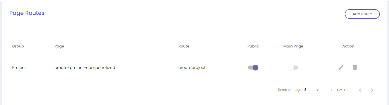
Page Routes
Page routing contains the flow from one view to another. This is also where the logic for the business rules can be applied.
| Feature | Description |
|---|---|
| Add Route | • Will open a dialog to which allows user to create/add page route in each group. |
| Public | • Set route as public route. |
| Main Page | • Enabled when created route was set as main page. |
| Edit | • Allow user to update created route. |
| Delete | • Allow user to delete created route |
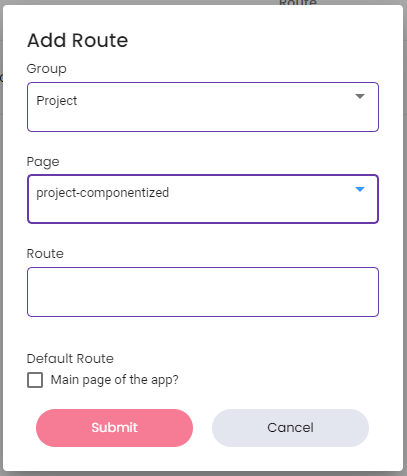
- Add Route
- This is the page where the developer can add the route.
Feature Description Add Route • Group, Page and Route is required when creating a route.
• The list of pages will vary depending on the selected group when creating Route.
• Can only create 1 route in each Page per group.Default Route • A checkbox that will only be available when the selected page is assigned as main component.
• Set as the default route when accessing the page.Submit • If clicked, it will create the route and will add on the page routes list. Cancel • If clicked, will terminate create action.
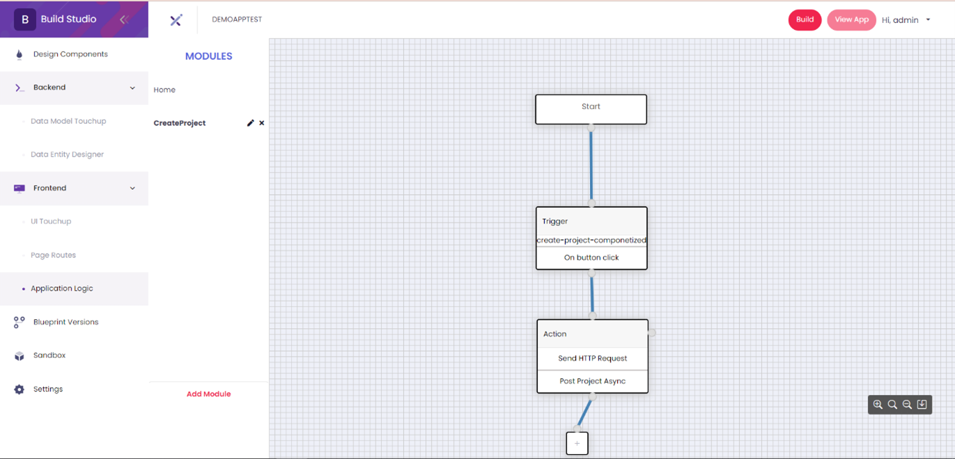
Application Logic
Once Application logic for the business rules were set and integration is created, “Build” button will be available. Once done building the Frontend, App Test Site will be available for testing.
| Feature | Description |
|---|---|
| Modules | • List of all created workflow modules which user can Add more modules by clicking Add Module button. Home module is default added. |
| Start | • This workflow action will initiate on creating module workflow. |
| Zoom In/Zoom Out | • Allows user to Zoom in/Zoom out canvas. |
| Reset Zoom | • If clicked, it will roll back to the initial default view. |
| Save Canvas | • If clicked, it will Save created workflow. |
- Add Module
- This is the page where the developer can add the Workflow Modules.

Feature Description Module Name • Users are required to enter module name. Submit • Save created workflow module and will be added in Modules List on the left side panel. Cancel • If clicked, will terminate create action.
- Create Workflow
- Creation of workflow that will be integrated in Groups in UI Touch up.
- Trigger
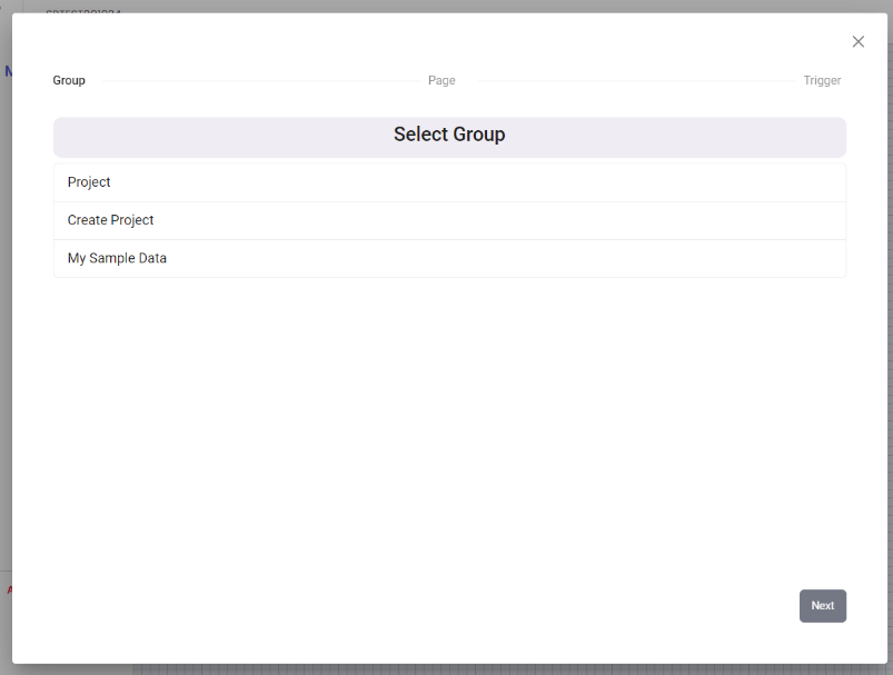
- A.1 SELECT GROUP
- Trigger
Feature Description Group • Select Group of modules that you want to create a workflow with.
• Can only select 1 group in each workflow creation.Next • Will only be enabled when a Group is selected.
• If clicked, it will proceed on “Page” selection.
- A.2 SELECT PAGE
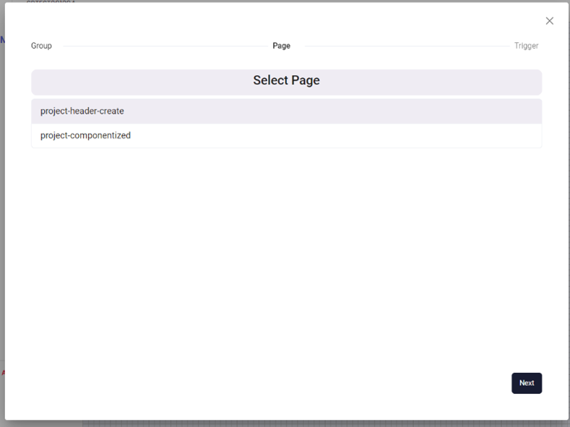
Feature Description Page • List down all pages under the selected group.
• Select a Page that you want to create a workflow with.
• User can only select 1 page in each workflow creation.Next • Will only be enabled when a Page is selected.
• If clicked, it will proceed on “Trigger” selection.
- A.3 SELECT TRIGGER
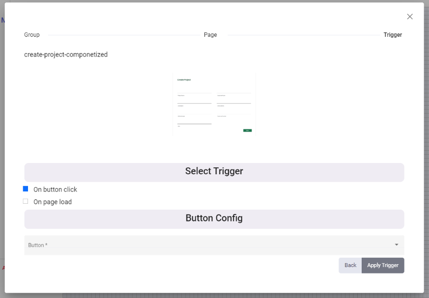
Feature Description Select Tigger • User has the option of “On button click” or “On page load’ trigger to be created.
• Can only select 1 trigger in each workflow creation.Button Config • Will only appear once “On button click” is selected.
• Selection of button config.Apply Trigger • Apply the created Trigger in the workflow. Back • Will navigate back to “Page” selection process.
- Action
- B.1 SELECT WORKFLOW
- Action
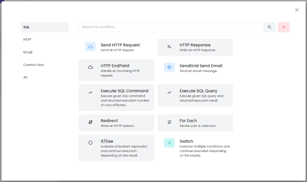
Feature Description All Tab • All workflows are displayed by default.
• Send HTTP request, SendGrid Send Email, Switch are only available workflows as of current.SQL Tab • Will only display workflows related to SQL HTTP Tab • Will only display workflows related to HTTP Email Tab • Will only display workflows related to email. Control Workflow • Will only display workflows related to Control workflow
- B.2 SEND HTTP REQUEST – Properties Tab
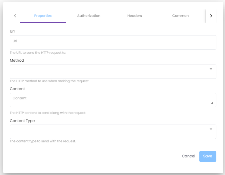
Feature Description Properties Tab • All fields are required, and input should be valid. URL • The URL to send the HTTP request to. Method • Select Method: Get, Post, Delete, Put. The HTTP content to send along with the request. Content • The HTTP Content to send along with the request. Content Type • The Content type to send with the request. Save • Will only be enabled once all tabs are filled out except Header tab.
• If clicked and validations passed, it will save all input data and action will be added in the workflow.Cancel • Will terminate action.
- B.3 SEND HTTP REQUEST – Authorization Tab
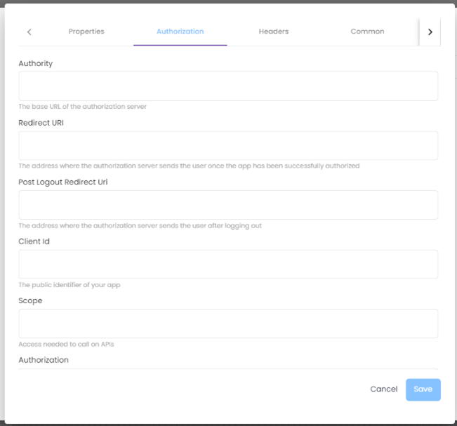
Feature Description Authorization Tab • All fields are required, and input should be valid. Authority • The base URL of the authorization server. Redirect URI • The address where the authorization server sends the user once the app has been successfully authorized. Post Logout Redirect URI • The address where the authorization server sends the user after logging out. Client ID • The public identifier of your app. Scope • Access needed to call on APIs. Authorization • The Authorization header value to send. Token • Key to be used alongside the Authorization header.
• Click the Authorize button, a new tab will open then Copy and paste the token on the Token input.
- B.4 SEND HTTP REQUEST – Headers Tab
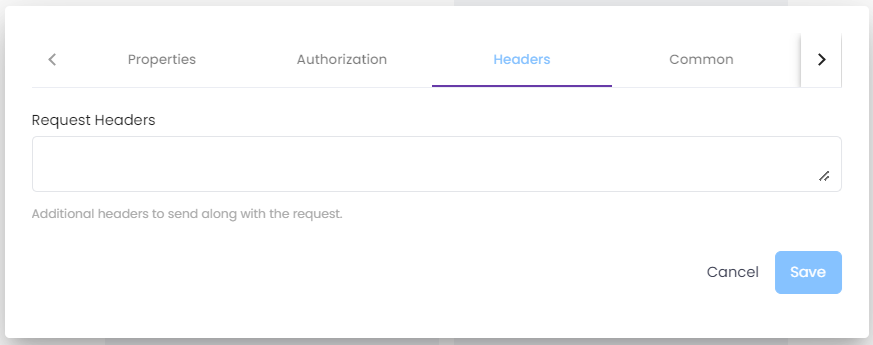
Feature Description Request Headers • Additional headers to send along with the request.
• This tab/field is not required.
- B.5 SEND HTTP REQUEST – Common Tab

Feature Description Common Tab • All fields are required, and input should be valid. Name • The technical name of the activity. Display Name • The friendly name of the activity. Description • A custom description for this activity.
- B.6 SEND HTTP REQUEST – Test Tab

Feature Description Test Tab • Click the Send Http Request button to send the input data from previous tabs.
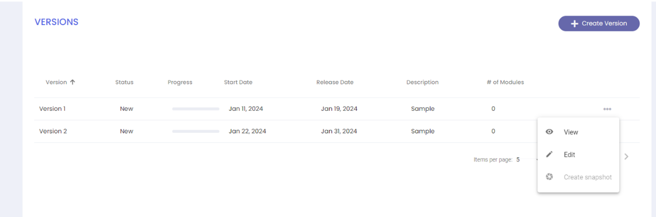
Version Release
way to differentiate current and past application configurations is through the Version Release.
| Feature | Description |
|---|---|
| Versions List | • Paginated Versions List. |
| Create Version | • Allow users to create versions. |
| Progress | • Progress of modules added in the version. New, Active and Completed |
| Ellipsis | • List of available actions: View, Edit, create snapshot, Use this version. • Available in each created version. |
| View action | • Dialog will appear, allowing the user to view details of the created version. |
| Edit action | • Dialog will appear, allowing the user to modify details of the existing version. |
| Create Snapshot | • Will change status from New to “Current” and will be use as Current version. • When creating snapshot on a” New” version the “Current” version will be updated “Active” status. |
| Use this Version | • Will change status from Active to “Current” and will be use as Current version. • Will only be applicable if Version status is “Active”. |
Create Version
This is the page where the developer can create the different release versions.
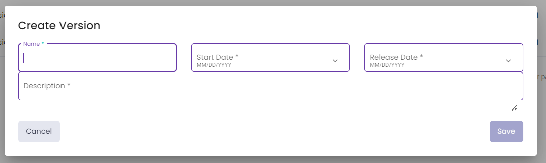
| Feature | Description |
|---|---|
| Name | • The User is required to input the version name. |
| Start date | • Date selection for Version’s Start date. |
| Release date | • Date selection for Version’ Release date. |
| Description | • Input field for Version’s Description. |
| Submit | • If clicked, it will Save created version and will be added in Versions List. |
| Cancel | • If clicked, it will terminate create action. |
Version Modules
This page list down the modules added in each version. The modules are created from Design Component page.
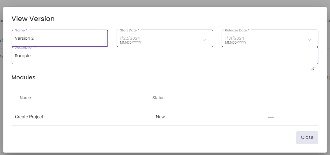
| Feature | Description |
|---|---|
| Name | • Name of module which added in this version from Design components. |
| Status | • Display module status. New status is selected as default. |
| Ellipsis | • Edit action which allows user to update each module status which is New, Active and Completed. |
Blueprint Versions
This page is the Blueprint section, here, you can create multiple versions of your selected solutions.

Sandbox
This page is for publishing frontend in the sandbox, below is the activity log when it was deployed

| Feature | Description |
|---|---|
| Deploy API and Identity Server | • This sets up the backend services, which handle data processing, storage, and user authentication. |
| Deploy Angular SPA | • This sets up the frontend, which is the user interface of your application that users interact with. |
| Table of Contents | |||||
|---|---|---|---|---|---|
| Main Page | Ideation Studio | Design Studio | Project Hub | Build Studio | Go Live |